
Ever Wondered Why a Room Feels Cozy or Cramped?
Picture this: you walk into a cafe with deep red walls, and suddenly you’re buzzing with energy, ready to chat and linger. Now imagine the same spot painted in soft blues, and instead, you’re unwinding, sipping tea in quiet reflection. That’s the quiet magic of color at work. It’s not some abstract art school lesson; it’s a real force in how we build and live in our world. Honestly, this isn’t talked about enough in design circles, but color theory in architectural design is the unsung hero that turns bland boxes into spaces that breathe life.
I’ve been knee-deep in SEO and copywriting for years, drawing from folks like Brian Dean’s no-nonsense strategies and Neil Patel’s audience-first approach. And let me tell you, when it comes to architecture, color isn’t just decoration. It’s a playbook for evoking feelings, guiding movement, and even tweaking how big or warm a room feels. For architects, interior designers, urban planners, design students, and even property owners curious about why their living room feels off, this guide breaks it down. We’ll explore the science, toss in some real-world hacks, and give you tools to apply it yourself. Let’s dive in.
Table of Contents
- The Basics of Color Theory: Wheels, Harmonies, and Why They Matter
- Color Psychology: How Hues Hack Our Minds in Built Spaces
- Mastering Color Schemes: From Monochromatic to the 60-30-10 Rule
- Applying Color Theory to Interior Design: Rooms That Work for You
- The Role of Color in Urban Planning: Cities That Feel Alive
- Warm vs. Cool Colors in Commercial Spaces: Energy or Calm?
- Lighting, Materiality, and Cultural Symbolism: The Full Picture
- Comparison Table: Warm vs. Cool Colors
- FAQ
- Wrapping It Up: Your Next Steps
The Basics of Color Theory: Wheels, Harmonies, and Why They Matter
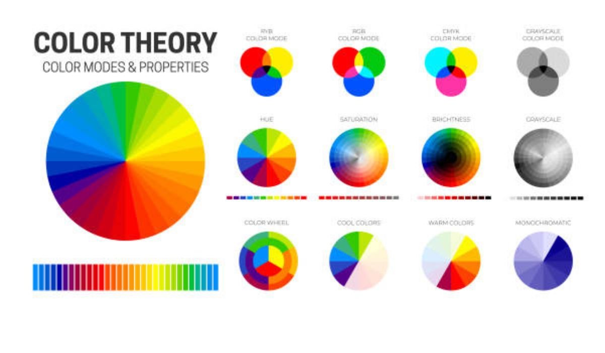
You might not know this, but color theory traces back to Sir Isaac Newton splitting light through a prism in the 1600s, creating the color wheel we still use today. At its core, it’s the art and science of mixing hues to create visual harmony. Think of the wheel as your compass: primary colors (red, yellow, blue) at the center, secondaries (orange, green, purple) branching out, and tertiaries filling the gaps.
In architecture, this isn’t fluff. Colors shape spatial perception. A dark ceiling can make a high room feel intimate, while light walls push boundaries outward, tricking the eye into sensing more space. Well, let’s break that down. Harmony comes from schemes like monochromatic (variations of one color for a sleek, unified look), analogous (neighboring hues like blue-green-blue for subtle flow), or complementary (opposites like blue and orange for punchy contrast). I’ve seen architects nail this in modern offices, where a monochromatic gray palette calms the chaos of open plans.
But here’s a tangent: remember those old Victorian homes with wild wallpapers? They played with patterns and colors to add depth, a trick that’s making a comeback in sustainable designs using natural pigments. It’s quirky how history loops back, right?
Color Psychology: How Hues Hack Our Minds in Built Spaces
Colors aren’t neutral; they stir the pot psychologically. Warm tones—reds, oranges, yellows—amp up energy, making hearts beat faster and spaces feel alive. Cool ones—blues, greens, purples—dial it down, promoting focus and tranquility. In my experience, property owners often overlook this, painting a bedroom red and wondering why they can’t sleep.
The psychological impact of color in architecture is backed by studies: one from the University of British Columbia found blue boosts creativity, while red sharpens attention to detail. But it’s not one-size-fits-all. Cultural twists add layers—white means purity in the West but mourning in parts of Asia. Architects must tread carefully here, especially in multicultural cities.
Rhetorically, why do hospitals lean on pastels? They soothe anxiety, creating a thermal sensation of coolness even in stuffy rooms. Some experts disagree on exact effects, but here’s my take: test it out. Paint a sample wall and live with it a week. You’ll feel the shift.
Mastering Color Schemes: From Monochromatic to the 60-30-10 Rule
Let’s get practical. Color schemes are your roadmap. Monochromatic keeps it simple: shades of gray in a minimalist loft for architectural harmony. Analogous adds warmth: think earthy greens and blues in a spa, easing transitions between rooms.
Complementary? That’s drama—red accents against green walls in a gallery, drawing eyes to art. Then there’s the 60-30-10 rule, a gem from interior pros. Sixty percent dominant color (walls, floors), 30 percent secondary (furniture, rugs), 10 percent accents (pillows, vases). It prevents overload, like in a living room where beige dominates, navy supports, and gold pops.
You might not know this, but this rule adapts to architecture too. In urban facades, 60 percent neutral brick, 30 percent painted trim, 10 percent vibrant signage keeps things balanced. It’s like a recipe: tweak ratios for taste, but stick close for success.
Applying Color Theory to Interior Design: Rooms That Work for You
Interiors are where color theory shines brightest. How color affects spatial perception is key—light hues expand small apartments, dark ones cozy up vast halls. For property owners, start with function: kitchens crave warm yellows for appetite, bedrooms cool lavenders for rest.
The 60-30-10 shines here. Say, a monochromatic scheme in whites for a serene bathroom, or analogous blues in a study for focus. Add storytelling: I once advised a client to use complementary reds and greens in a dining room, evoking holiday cheer year-round. It worked wonders.
But don’t forget visual communication. Colors guide flow—bright accents mark doorways, subtle shifts define zones in open plans.
READ ALSO: How Architecture Shapes Social Behavior
The Role of Color in Urban Planning: Cities That Feel Alive
Zoom out to cities, and color becomes a community tool. In urban planning, hues create identity: think Jaipur’s pink sandstone or Jodhpur’s blue houses. They aid wayfinding—red for danger zones, green for parks—and boost moods, reducing stress in concrete jungles.
Cultural symbolism matters hugely. Red might energize a marketplace but overwhelm a quiet neighborhood. Planners use color for harmony, avoiding chaos with palettes that blend buildings and nature. A study in Landscape and Urban Planning noted balanced colors improve resident well-being, making spaces feel safer and more inviting.
Honestly, some cities get it wrong with mismatched developments. But done right, like in Amsterdam’s coordinated canalside facades, it fosters pride.
Warm vs. Cool Colors in Commercial Spaces: Energy or Calm?
Commercial spots thrive on this divide. Warm colors in cafes stimulate chatter and quick turnover—red booths make you hungry faster. Cool tones in offices foster productivity, with blues cutting distractions.
Using warm vs. cool colors in commercial spaces depends on goals: retail might mix for impulse buys, hotels lean cool for relaxation. Natural light flips this—warm rooms glow under sun, cool ones soften harsh fluorescents.
In my view, hybrid works best: warm accents in cool schemes keep energy without burnout.
Lighting, Materiality, and Cultural Symbolism: The Full Picture
Lighting changes everything. Natural light warms colors, artificial cools them. Pair with materials: wood absorbs hues softly, metal reflects boldly.
Cultural symbolism adds depth. In India, saffron signifies spirituality in temples; in the U.S., it’s more neutral. Architects blend this for inclusive designs, like multicultural community centers with adaptable palettes.
A mini anecdote: I recall a project where ignoring local symbolism led to repaints. Lesson? Research first.
Comparison Table: Warm vs. Cool Colors
| Aspect | Warm Colors (Red, Orange, Yellow) | Cool Colors (Blue, Green, Purple) |
| Emotional Impact | Energizing, stimulating appetite and conversation | Calming, promoting focus and relaxation |
| Spatial Perception | Makes spaces feel smaller, cozier | Expands rooms, creates openness |
| Best For | Kitchens, retail, social areas | Bedrooms, offices, healthcare |
| Pros | Boosts mood, encourages activity | Reduces stress, aids concentration |
| Cons | Can overwhelm if overused | May feel cold or detached |
| Examples in Architecture | Vibrant cafe walls, urban signage | Hospital interiors, corporate lobbies |
This table simplifies choices—use it as a starting point for your projects.
FAQs
What is the psychological impact of color in architecture?
Colors influence emotions subtly; warm hues like orange energize, while cool ones like green soothe. It’s not magic, but studies show they can alter perceived space and mood in buildings.
How does color affect spatial perception?
Light colors push walls back, making rooms feel larger; darker ones pull them in for intimacy. Handy for small apartments or grand halls.
What’s the best way to apply color theory to interior design?
Start with the 60-30-10 rule: dominant color for walls, secondary for furniture, accents for flair. Test with samples under your lighting.
What’s the role of color in urban planning?
It aids identity and navigation—think color-coded districts. Balanced palettes prevent visual clutter and enhance community feel.
When to use warm vs. cool colors in commercial spaces?
Warm for high-energy spots like gyms; cool for focus areas like banks. Mix for balance.
How does natural light impact architectural color?
It warms hues during day, so choose versatile shades. Evening artificial light can dull them, so plan accordingly.
What about cultural symbolism in color choices?
Varies widely—red means luck in China but caution elsewhere. Research your audience for respectful designs.
Wrapping It Up: Your Next Steps
Color theory in architectural design isn’t a rigid formula; it’s a flexible toolkit for creating spaces that resonate. From psychology to urban vibes, it offers solutions that educate and empower. As we look ahead, sustainable pigments and tech like smart lighting will evolve this further, making designs more adaptive.
What’s your take? Experiment with a room redo or sketch a color plan for your next project. If you’re a designer, share your wins in the comments—it could spark someone’s breakthrough. After all, great spaces start with a splash of insight.
YOU MAY ALSO LIKE: Beyond the Brick: Street Art and Urban Culture